Matik now supports Org Charts in Google Presentations!
Creating one is easy!
Create Google Sheet Org Chart
First, create an org chart in Google Sheets. This org chart will be a template that Matik will insert dynamic content into, so it doesn't have to contain all of your org data. Org Charts in Google Sheets require 2-3 columns. The first column represents a person on an org chart. The second represents who that person reports to. You can also include an optional 3rd column with additional tooltip information that displays when you hover over a block on the org chart.
- Create 2-3 columns in columns A and B in Google Sheets. Put at least one row of dummy data.
- Click on Insert > Chart in the menu bar.
- In the chart editor that pops up, select chart type: Organizational Chart. Extend the data in "Data Range" to greater than the maximum number of rows your dynamic content will ever return.
- If your data has headers, select "Use Row 1 as headers". Ensure ID (person), Parent (who they report to), and Tooltip(Optional) are populated with the correct data.
- Apply any desired formatting to the chart
Add your org chart to your Google Slides Template
Next, add this Org Chart to your template.
- In the Google Slide menubar click Insert > Chart > From Sheets
- Select the Google Sheet with your org chart and select the org chart from that Google Sheet
- Add the Google Slide to Matik as a new template or sync if already added.
Create and Tag your Org Chart Data Source and Dynamic Content
Add a data source for your org chart to Matik if not already linked to Matik.
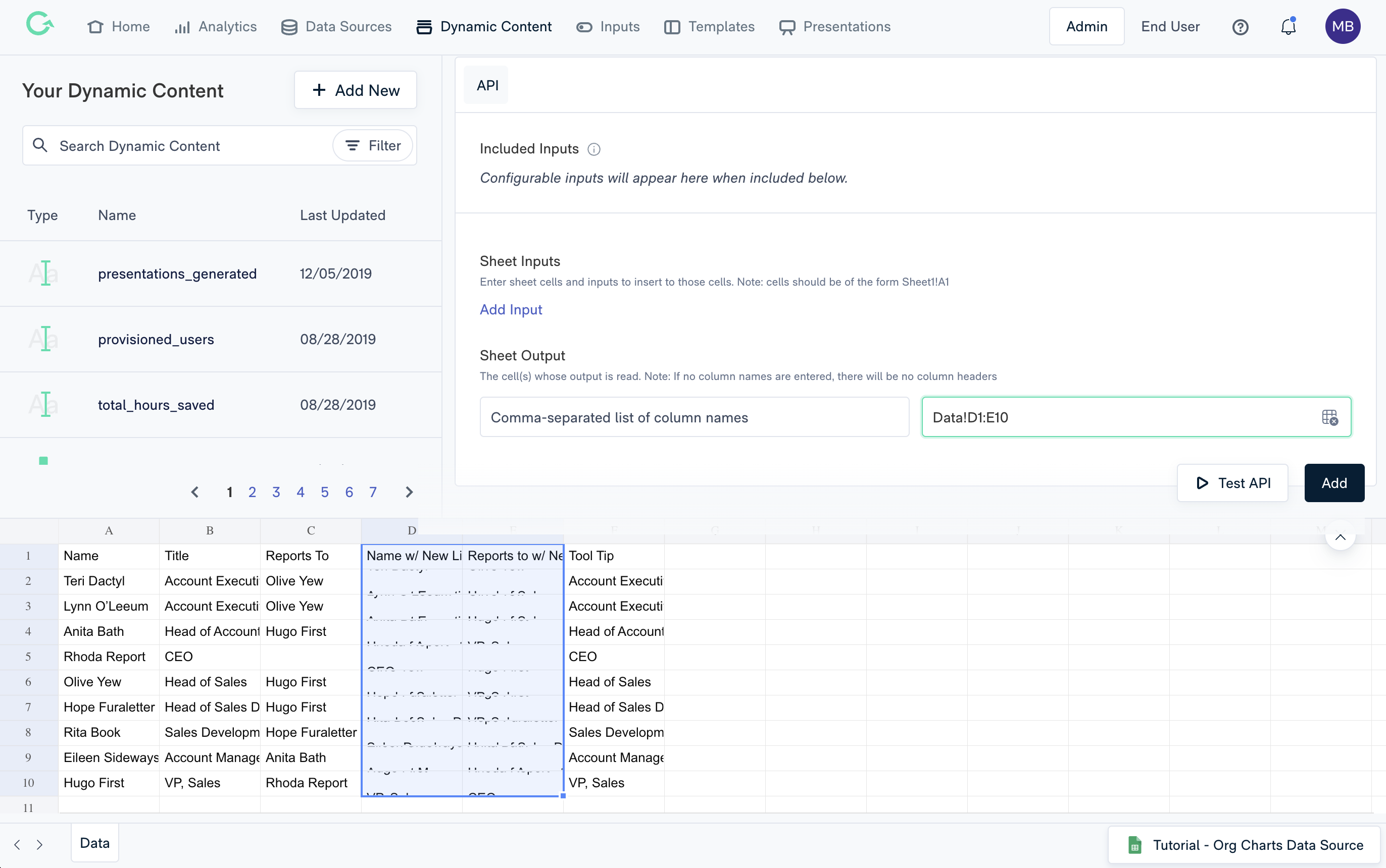
Since Org Charts in Google Sheets only accept 2 arguments, you may have to do some data manipulation if you want to display more information than just a name on the blocks in your org chart. For example, if you want a person's position included on the org chart, you will need to include their name and position in the first column, and who they report to and their position in the second column. This can be achieved using a concatenation function in your dynamic content or source data to combine the two data points. For example, in the screenshot below, we add the title to the name and also include two newline characters ( CHAR(10) ) to separate the name and the title. Note that the "Reports To" cell must match the value of that person in the name column. We have added additional logic to include the title in the same format. See this spreadsheet for an example.
Next, create your chart dynamic content. Your dynamic content should only return 2 columns (or 3 if using a tooltip column). In the example below, columns D and E are returned since they contain the concatenated name <> title data.

Tag and Test your Template
Tag your org chart dynamic content to your template's org chart. Finally, Generate a test presentation to view your final work!
Comments
0 comments
Please sign in to leave a comment.